Yu-Gi-Oh! TCG - 10 Censored Card Artworks
Differences Between Yu-Gi-Oh! Games
Yu-Gi-Oh! TCG is divided between the TCG (Trading Card Game), and the OCG (Original Card Game). The TCG is the version of the game distributed to the Americas, Europe, and the rest of the western world, and the OCG is distributed across Asia.
However, where these two games are distributed isn't the only difference between them: besides different banlists and committees, many cards have different names or artworks depending on where they were released. Today, we picked out 10 of these cards to show you!
10 Different Card Artworks
Please note: all cards are released first to the OCG, and then they are released to the TCG. This means that, usually, the OCG artwork is the original artwork. Furthermore, we added the Japanese version of all the cards below to their right. That being said, let's go!
1 - Armed Samurai Ben Kei
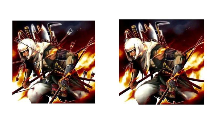
This monster's original artwork shows it covered with wounds, and there are arrows stuck to its body, which is expected on the battlefield. However, its western release didn't have the arrows to make it seem a bit more friendly.
This was supposed to make it a bit more appropriate for younger audiences or anyone who would rather not see such violent imagery.
2 - Axe of Despair
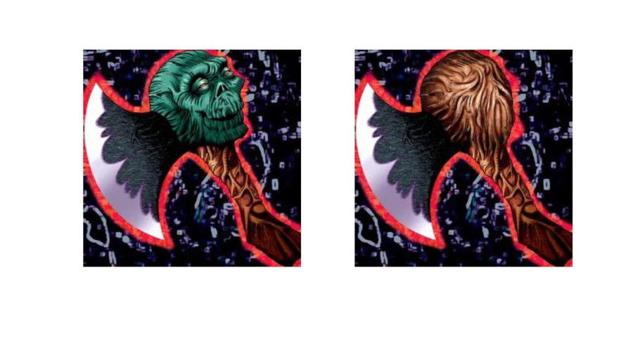
This card's TCG version didn't have a skull on its axe. The goal was to make it less scary, and more appropriate for all ages.
The OCG version with the skull had a darker and more threatening look that reflected the destructive power of the axe itself. However, the TCG version removed the skull to make it more neutral, and thus removed the direct reference to death and violence.
3 - Fiend Comedian
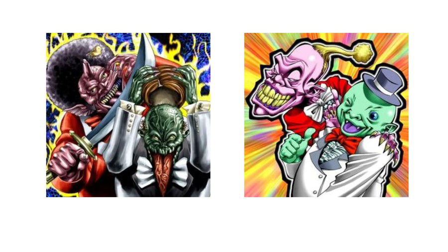
As with Axe of Despair, the goal was to make this artwork more pleasant to the eye. However, the entire illustration was practically redone because the original was considered too scary (which I have to agree) for the western release.
The OCG version of "Fiend Comedian" was way more demon-like and disturbing, which didn't fit the western audience, as it was, supposedly, younger. The TCG version is more cartoonish and less threatening.
4 - Artorigus, King of the Noble Knights
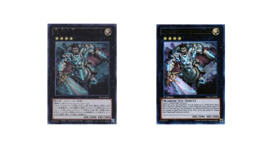
In this artwork, the blue line in Artorigus' armor was removed because it… looked too anatomical. The original intent was to show how powerful this king is, but it turned out a bit different…
5 - Asleep at the Switch
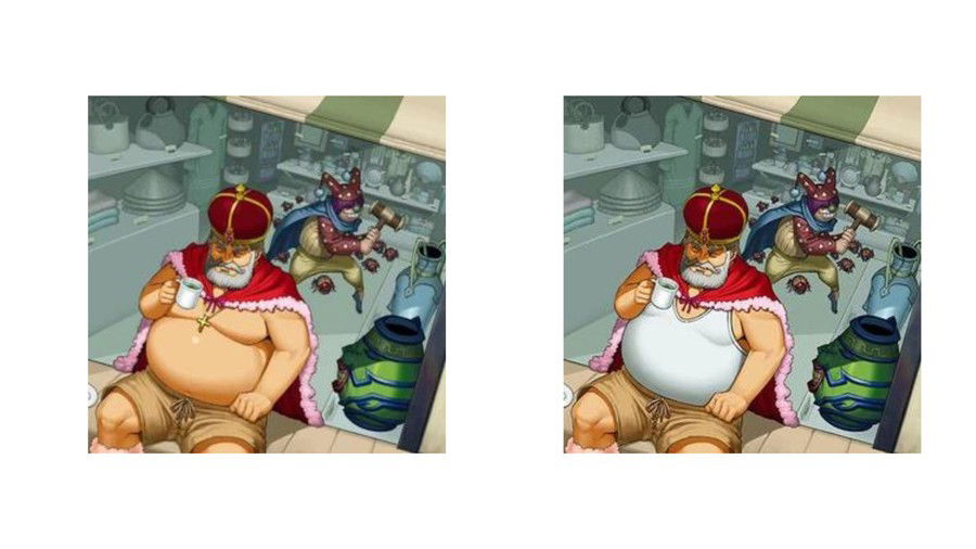
This card was considered too "out there" for a western audience. The original artwork shows a king without a shirt, wearing a cross, which was also removed for its western release to avoid religious controversies.
6 - Number 41: Bagooska the Terribly Tired Tapir
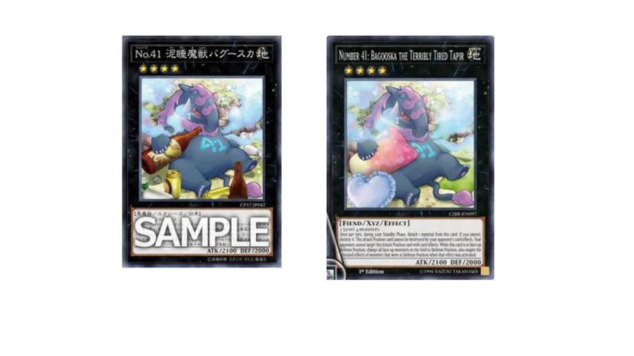
This card's international artwork replaced all bottles and tins of alcohol with pillows. Bagooska's OCG version shows it in a sort of inebriated state, with several drinks around to represent its lazy and carefree nature.
When it was time to release its TCG version, the depiction of alcohol was considered inadequate, particularly for a younger audience, and was replaced with pillows to stress laziness without showing any alcohol consumption.
7 - Call of the Earthbound
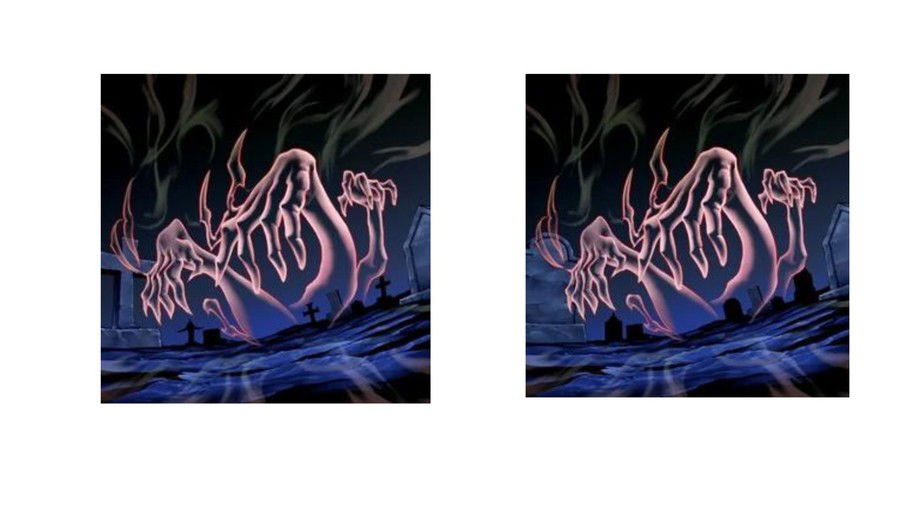
Call of the Earthbound's international version didn't show any crosses on its tombstones. They replaced them with curved tombstones, to avoid any religious connotation. This is a common change for western releases that you can spot in many cards.
8 - Amazoness Spellcaster
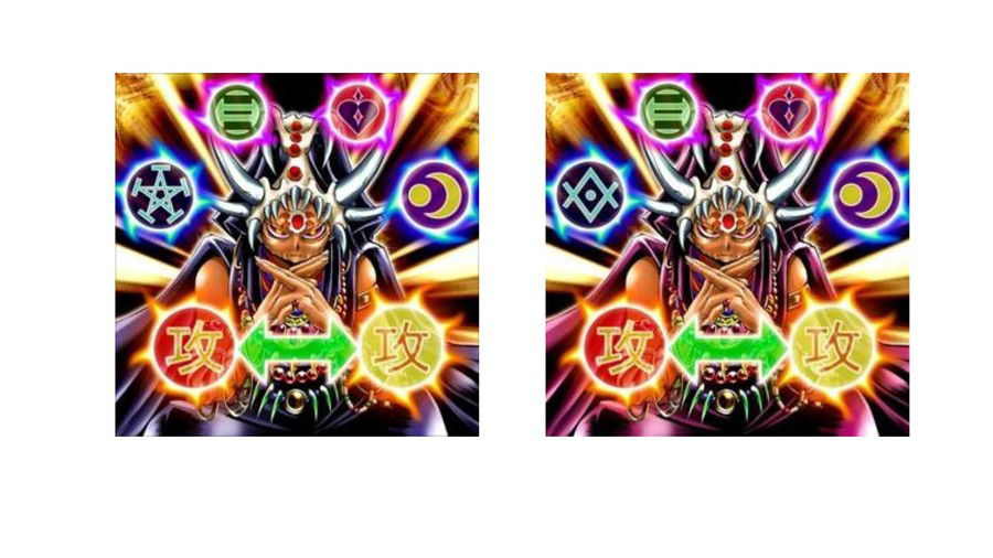
When this card was released in the western world, they edited its artwork and swapped the pentagram for a different symbol to also avoid religious connotations. Because the pentagram isn't particularly associated with any religious practice in the eastern world, the OCG version still has it. But this is an understandable choice, considering Christianity is the largest religion in most countries where the TCG is released.
9 - A Deal with Dark Ruler
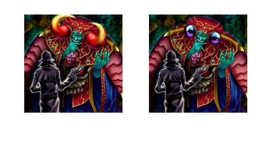
In this card's western version, the horns of the monster in the card, "Dark Ruler Ha Des", were replaced by blue orbs, once again to avoid any type of religion-related misunderstanding.
The OCG version shows that these horns are part of the character's demon-like features, and connect it to mythological creatures. However, for the western release, they were considered potentially offensive to some cultures and religions, and they ended up replacing them with more neutral magical elements.
10 - Absorbing Kid from the Sky
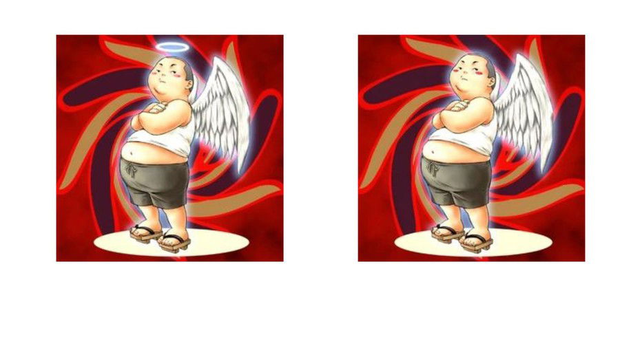
Curiously, Konami hasn't only removed pentagrams and horns. They truly seem like they want to avoid any type of religious symbol as much as they can, as the halo, a symbol commonly associated with good-natured angelical figures, was removed from this card.
Final Words
Countless cards got modified artworks when they were released to the TCG, so these 10 cards are only the best ones we found to show what, exactly, Konami tends to avoid depicting in the western world. It truly seems like they avoid showing anything minimally religious or violent.
Do you think these changes were necessary? Which card should have gotten a different artwork but didn't? Which change was well-deserved? Tell us your thoughts in our comment section below!
To access further details about the Yu-Gi-Oh! TCG universe, keep browsing our articles.
Cards Realm thanks you for your support. See you next time!





— Comments 0
, Reactions 1
Be the first to comment